OXO Commons Case Study
OXO wanted to make improvements to their user interface. Their goals were to improve their content relevancy, increase user engagement and help users feel more comfortable in front of their teams. Overall, OXO wanted to help users look their best, while instituting a design refresh for their site.
Affirma Consulting analyzed the pain points of OXO’s user interface and user experience. Affirma saw that OXO’s posting capabilities limited user’s abilities to create content. Users had no way to save content as a draft, and recreating content from existing templates was difficult. Along with posting issues, external content was not relevant to the user, and notifications were difficult to control. 
- To address these issues, Affirma implemented improvements in interface and experience.
- Affirma implemented a wide canvas area, the ability to save, a user guided help text, and an interactive widgets menu.
- Affirma also provided solutions that enabled users to view content within the feed as well as the ability to view static content on the right side of their page.
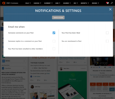
- Affirma also made changes to the notification settings for users. Users were given choices on their preferred method of notification, such as receiving comments on posts, or when receiving likes.
OXO completed their consultation with a user interface focused on the customer experience. Users are better able to engage with their content with a posting experience centered around the creator. OXO also now has a more customizable notification system and overall user experience.


